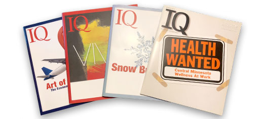
I had the great pleasure to be the creative coordinator on IQ, the quarterly publication of the Initiative Foundation. The path of a project is usually a one-lane road. One follows the process to create a page, a poster, or a mailer. Sometimes though a designer gets a BIG project. Like a magazine. Publication design is multi-disciplinary and the final deliverable is an amalgamation of many smaller parts.
Many parts of publication design were a labor-of-love for me. Typography especially. I reveled in hours of character styles, paragraph styles, kerning, and tweaking. I must confess that setting the copy of IQ magazine was, so far, the most fulfilling task of my design career. Infographic design was another favorite of mine. Though the pleasure of creating a successful infographics came from the complexity of the task rather than the meditative simplicity of setting type.
But every project has its uphill slogs. The most onerous task of my career was coordinating and designing the inclusion of advertisements into and around my beautiful layouts. Nothing muddies up a successful layout than residing next to a 10-year-old, photocopied dog of a quarter-page ad. Happily, the excitement of creating beautiful typography, clear and compelling infographics, and working with talented freelance editors, writers, photographers, and illustrators far outweighed whatever pain ugly advertising caused.

