There is an advantage to creating your own art, whether photo or illustration. Using home-made means no limit to the size of the piece. No constraint on the shape of the copy layout. No need to change the headline because you can’t find that just-right stock image. The trade-off is time. Creating a beautiful illustration or taking that perfect picture can put serious breaks on workflow. It was not so long ago, but I can scarcely remember what my job was like before stock art came down in price.
It’s not so often that I’m gifted with the time to create the whole of a piece from a blank canvas. The typography is always mine. The logo, almost always, as well. Only occasionally do I get to create the art and everything else in a design from scratch.
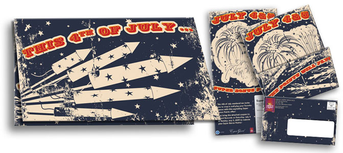
The headline, “The Points Will Fly, This 4th of July,” suggested a progressive reading. This restricted audience behavior is achieved by placing one stanza on each page, folded open as the viewer reads. This idea would have been an impossibility using commercial stock art. The chances that I find three progressive images being very slim. Instead, I created my own motif of rockets for the first panel. I recycled that image into rockets blasting off in the next then exploding in a graphical representation of fireworks on the last panel.
The look I was creating started to appear, cheerfully, based in a carnival atmosphere of an earlier day. It occurred to me that this would be a perfect ground for a grunge piece. It was something I had been noodling with for a while, unable to find a fitting piece. Unfortunately, the grunge look appeared too complex for the illustrative work I’d completed so far. To remedy this situation I reduced the palette to only four colors. A blue and cream for the background. A red and hot yellow for the foreground.
At that point, the grunge look, the illustrative rockets, the big-top-egyptian type, and 1900’s color palette all fell together like I was meant to be.

