A good designer needs to know the tools of the trade just like any other professional. The good news is that these are attainable skills. Time and an inquisitive nature are all that is required to gain mastery over a designer’s tools.
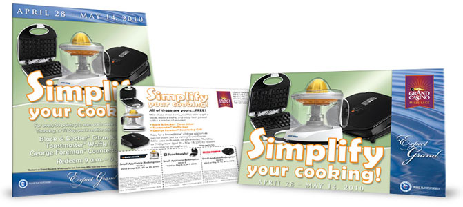
The problems presented by Grand Casino’s small appliance promotion required a full workout of my Photoshop knowledge. As with most product giveaways, the hierarchy must start with the product. Usually, this goal is made super easy by high-quality images. Sometimes they’re even pre-clipped with multiplied shadows.
However, I knew at the beginning of this project that there would present a different set of hurdles. The most desirable object, the Citrus Juicer, was mostly transparent. Or, more accurately, it was transparent in REAL life. The image provided from the vendor was flattened over a white background (not anyone’s fault, that’s an OK way to take a picture of a semi-transparent object).
To get the juicer to appear to be in real space with the grill and the waffle iron I had to clip out only the parts of the Juicer that one could see all the way through. This became a bit of a judgment call in the handle area because, while the material was transparent, it was so thick that any light passing through was bent so as to be unrecognizable as an image. Next, I adjusted the blend modes to achieve an approximation of the way light would act as it passed through the plastic. The end solution involved three blended, semi-transparent layers in overlay, lighten, and multiply modes.
This extra image layering complexity binds the design to Photoshop (a somewhat inefficient setup) because, at the time, InDesign would not multiply transparent images without having each image exist on its own layer. This was a small sacrifice to make in order to make the provided images exist together in real space, essential to the logo being seen as a single element.

