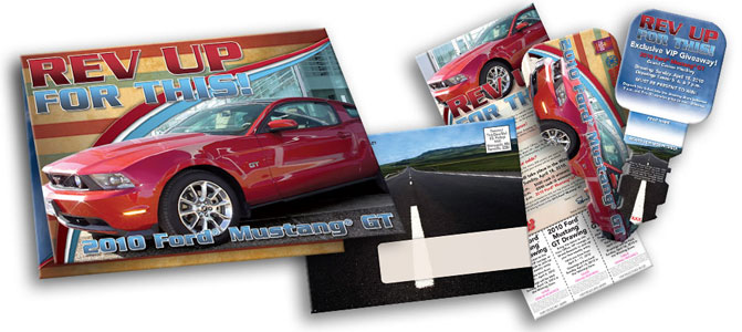
This envelope mailer is a good example of how and why to give priority to a picture over the logo. Art from vendors is often of poor quality or not integral to communication. When this is the case, it is enough to simply place the image in a secondary position somewhere within the piece.
However, when the provided image is the strongest communicator, a hot red sports car, for example, it becomes an essential design goal to make the image hierarchically number one, the logo secondary. In this instance, the image of the Mustang was pretty good. The lighting was nice and shiny, the setting sort of fashion-forward. The only issues were cloning out the dealership window key box and the reflection of some day-glow green caution cones in the side of the car.
One method to ensure a picture occupies the primary position within the hierarchy is to place the image squarely in the foreground. If the picture comes with a background that is ugly or just not useful, then one’s options are limited. Just drop out the background and drop in the picture.
In this piece, though, I liked the background and wanted to keep it. The issue this raises is how to make the logo pop from the background and make the car pop from the logo. My solution involved creating a very clear foreground for the car, running a mid-ground behind it for the logo. The background is visible just enough to contain the real-life setting of the car.
This presents a very logical hierarchy for the viewer and therefore emphasizes the most important aspect of this promotion: Hot FREE Mustang!

