I love rebuilds. I imagine it’s like being an 80’s movie reboot writer. I was given a musty pile of aged work and tasked with picking out the good bits and upcycling them into something functional.
In this case, I was handed a stack of photocopied (and re-photocopied) handouts describing the products and services of Falcon National Bank. They were a mash-up of vaguely interesting descriptive copy, broken uncomfortably by heavy blocks of disclaimer copy. The only embellishment was clipart and the whole mess was printed on a random selection of colors from Kinko’s Astrobright selection.
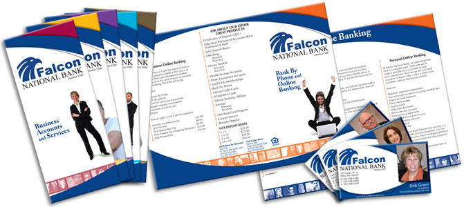
The main goal of my rebuild was to corral the documents under a single graphical system based on the logo (no other brand identity existed). I did this by asserting the upper and lower curves of the falcon’s eye as the boundaries of the copy area. The brochures are differentiated by an accent color and a conservative yet fun person picture.
After that, all that was left to do was to tame the giant pile of formal copy. This was my favorite part of the project. I revel in good typography. I could spend days leading and kerning, searching for widows and orphans.
This project is also a good example of work, well done, leading to more work. After seeing the first set of proofs, the client handed us the entirety of their business card requests as an add-on to the project.

